Background
Bladder Cancer is the 5th most common cancer in Canada – 4th among men and 12th among women. There was no organization that provided consistent awareness, support or fundraising for patients, families or doctors for bladder cancer in Canada. To fill this critical need, two bladder cancer survivors started the organization.

Challenge
Since the organization was new, there wasn’t an established brand identity. Ascenda Brand Marketing was challenged with creating a brand that would position the organization as informed, engaged and as a trusted authority amongst its target audiences.

Solution
To start establishing the brand, we first created a logo that became a recognizable symbol for Bladder Cancer Canada (BCC). The design used the universal bladder cancer yellow ribbon and had it surround the shape of a bladder resulting in the symbolic BCC glyph.

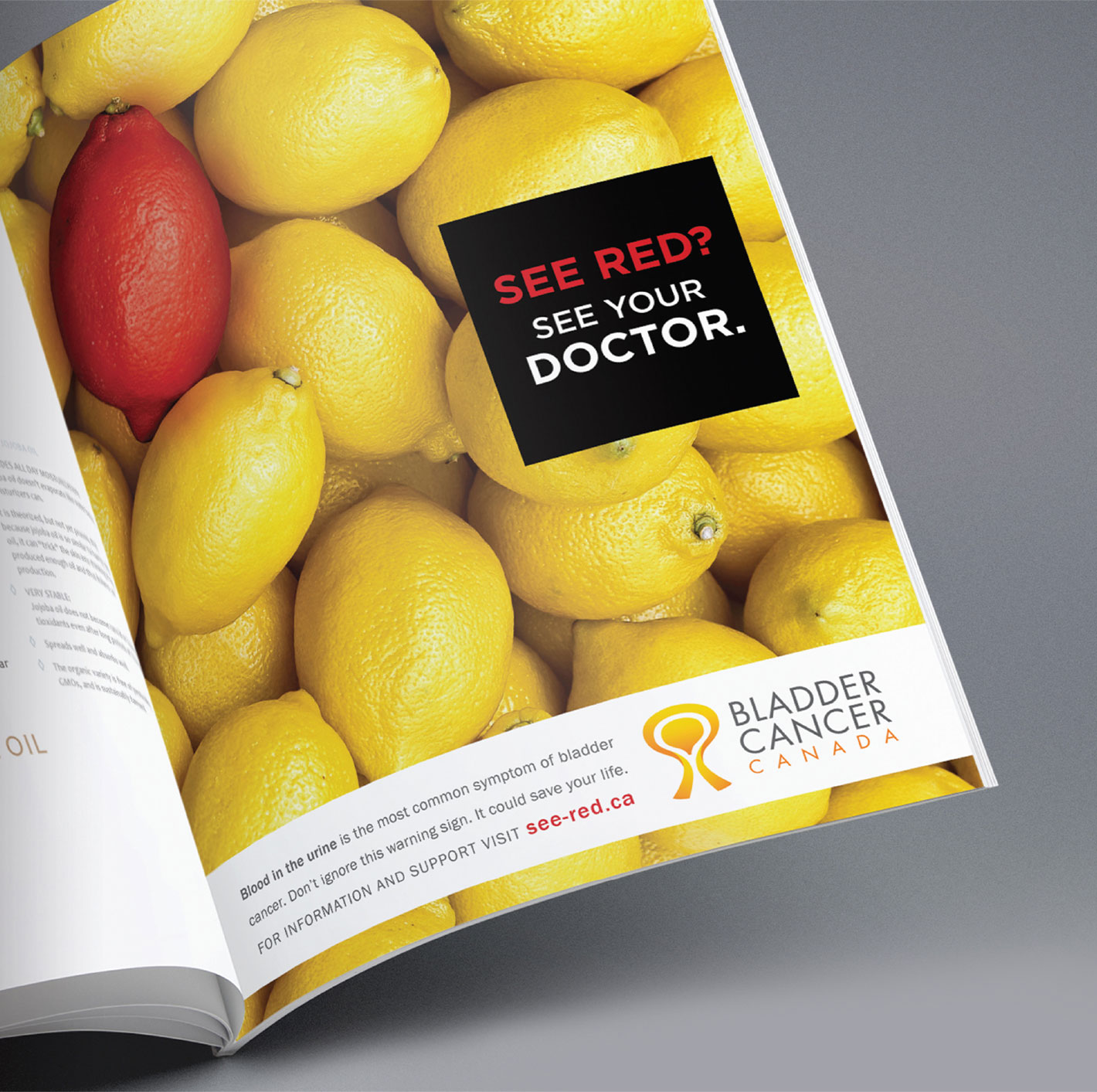
To help further build the brand identity, a national mass awareness campaign was used to communicate the main warning sign of the disease, blood in urine, with both the Canadian medical community and the general public. To signify blood, a red lemon was added to a bunch of yellow lemons, making it look immediately out of place. This juxtaposition, with the contrast of colours, ensured the PSA stood out in any medium and was supported by the tagline “See Red? See Your Doctor.” This became a visual metaphor for blood in urine which was an easy to understand concept for our target audiences.

Results
As a newly established non-profit with an extremely limited budget, the impact that was seen was huge and the results were significant!
Since the inception of the organization, all yearly objectives continue to be surpassed and the organization has been able to increase awareness, donations, engagement and membership growth. Since then, BCC’s “See Red? See Your Doctor.” PSA has been recognized across the country and has been honoured with 10 national advertising/marketing industry awards.


